Linkedin Creatives
Linkedin Creatives was a spontaneous task, a projects built to cater for designers and creatives of the world. Linkedin is another social media platform strictly focused on job search. Unfortunately for creatives in order for a recruiter to view their work/ portfolio, one will be lead out of Linkedin forcing to open another unnecessary browser.
With a high focus on building a more intuitive job search platform for creatives, my group and I had 2 and half weeks to create a way to link designer's portfolio into Linkedin, without creating another socila media platform, such as Instagram or TikTok to name a few. Making it more convenient for both recruiters and designers to find each other, not only through their experiences but also through their designs visually.
Duration: 2 1/2 Weeks
Team: 4 designers
Role: UX UI Designer, Researcher
Tools: Figma, FigJam, Dribble, Google, Linkedin, Toggle
The Research & Synthesis

As my team and I began our research process, we started with some competitive and comparative analysis with about 5 different companies, who are somewhat similar in terms of housing portfolios, and mainly focused for creatives. Through screenshots and plenty of sticky notes we were able to determine some key insights through our comparisons. Some are which, very few websites offer great networking opportunities. Competitors have great tools (ie. light boxes) to showcase creative work. Formatting tools are important when creating unique content. Views tracker (shows traction on a post).
Running parallel to our comp. analysis was our user research, which also uncovered some similar trends. Our affinity map allowed us to view 2 sides to this research, being able to showcase their work creatively, but still continue to build their network.
From here, we thought to expand the profile page, by enhancing it and allowing for a way to create a portfolio, or add sections to showcase designs, very similar to other inspirational sites we looked into. Adding a "portfolio" tab into the profile page will provide a way for both creatives and recruiters to find each other through connections, sponsors, brandings, and hashtags.
The "I Statement..."

"I statements.." provided us insights on what exactly do creatives would like to have and see on Linkedin. North of this golden thread allowed us to understand that creatives wishes for an intertwined social aspect to both job search and showcase. While south of that line is a consistent want for job connections and a continuous connection with peers.
The Inspirations

We were inspired on different ways the following sites showcase portfolios and designs for creatives. By using a lightbox for example, highlights ones work and sparks curiosity from recruiters' point of view, as well as other creatives. As we research competitors, we have gained ideas on how we can utilize past and present work of creatives and showcase them in this platform.
The Persona
I statements lead us to create our persona, of course, a designer persona only makes sense. As we kept our persona in mind, and her goal of putting forward the right skills and being able to highlight her work and its uniqueness. Also, not losing sight of her pain points and frustrations. We came up with a problem statement that would surface her goals and her needs, as this will remind us of the things we need to include in our sketches and wireframes.

The Problem
Statement

The Sitemap
Because Linkedin is an existing site, we didn't change much on how the site is structured. We focused more on what we were adding, the Portfolio section. As you look at the site map, all portfolio feature we created we kept it located in the "Profile Page", as you click into the profile page is where a tab to create your Portfolio can be found.


The Ideation & Design Decision
As we started to sketch and draw, we considered and took inspiration from several places, and took on ideas such as the lightbox, as we felt that it could help enhance our platform. Identifying the MVP (the portfolio) became an important task as it enabled us to refine what we could and should use within our design.
We had to continue and remember the question of "Why Linkedin for creatives?" without altering it and creating another social media platform. We kept Linkedin's current look, color palette, and feel, and kept its originality, and continued that consistency throughout the new portfolio page.


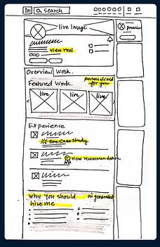


The Wireframe
Although it may seem as if wireframing was a breeze, considering Linkedin is an established site, and us keeping most of its features and components the same. Wireframing took the most time, as we all had a part in sizing, precisely measure spacing, creating interactive, and creating existing components, shape by shape. We had to create multiple buttons and image holders to make life easier for us when we get to high fidelity. We also worked with modes during wireframing to switch on and off colors when we wanted to see more depth and visuals in low fidelity.

The Brief: Why Linkedin for Creatives?

ONLINE RESOURE FOR JOB SEARCH & PROFESSIONAL CONNECTIONS

SEO & SKILLS TAGGING ALLOW RECRUITERS TO FIND YOUR WORK

ADD CONTRIBUTORS ENABLES FURTHER REACH OF CONTENT

INTERGRATED SYSTEM WHERE WORK EXPERIENCE & PORTFOLIO PIECES CAN BE CROSS REFERENCED SEAMLESSLY